Rolls Royce Logo - Design and History
The Rolls Royce logo consisting of the two Rs or the double R clearly stands for the Rolls and Royce, the two founders of this car manufacturing company. There is nothing special about the design of the logo, but the brand name is so strong, the logo looks special. In 1998, BMW the option on the trademarks, licensing the name and "RR" logo for £40m.
In 1884 Frederick Henry Royce started an electrical and mechanical business. He made his first car, a "Royce", in his Manchester factory in 1904. He was introduced to Charles Stewart Rolls in a Manchester hotel on the May 4 that year, and the pair agreed a deal where Royce would manufacture cars, to be sold exclusively by Rolls. A clause was added to the contract, stipulating the cars would be called "Rolls-Royce".
Indian Premier League - IPL Logos
The Indian Premier League (formerly known as the "DLF Indian Premier League"), is a Twenty20 cricket competition created by the Board of Control for Cricket in India (BCCI) and sanctioned by the International Cricket Council. The first edition of the Indian Premier League started on 18 April 2008. The IPL now consists of 8 teams. The IPL is the most-attended cricket league in the world and in 2014 ranked sixth by average attendance among all sports leagues. In 2010, the IPL became the first sporting event in the world to be broadcast live on YouTube. The brand value of the IPL in 2019 was ₹475 billion (US$6.7 billion), according to Duff & Phelps. According to BCCI, the 2015 IPL season contributed ₹11.5 billion (US$160 million) to the GDP of the Indian economy.
- Chennai Super Kings
- Delhi Capitals
- Kings XI Punjab
- Kolkata Knight Riders
- Mumbai Indians
- Rajasthan Royals
- Royal Challengers Bangalore
- Sunrisers Hyderabad
The IPL logo consists of two pieces
- Batsman hitting a attacking stroke to represent the game of cricket. The swish of the ball moving attempts to signify that the game is fast moving and more exciting.
- The text "Indian Premier League" written in blue, probably to represent India's colours.
Overall, I am quite disappointed in the logo. Firstly it lacks any color and originality. I think the logo could have been more colorful. The logos of the participating teams are a lot more colorful and original and the IPL logo pales in comparison even more. Click the Read more link below for additional details on the logos.
Dallas Cowboys Logo - Design and History
The Dallas Cowboys are a professional American football team in the Eastern Division of the National Football Conference (NFC) in the National Football League (NFL). They are headquarterd in the suburb of Frisco, Texas which is a northern suburb of the Dallas metroplex. The team move started to play its home games at Cowboys Stadium in Arlington beginning in the 2009 season, moving from the city of Irving.The Cowboys joined the NFL as a 1960 expansion team. The team's national following might best be represented by its NFL record of consecutive games in front of sold-out stadiums.
The Dallas Cowboys' blue star logo is associated with the team is one of the best known logos in sports. The blue star originally was a solid shape until a white line and blue border was added in 1964. The logo has remained the same since. Today, the blue star has been extended to not only the Dallas Cowboys, but owner Jerry Jones' AFL team, the Dallas Desperados that have a similar logo based on the Cowboys.
The star has a special place in Texas history as well. The "lone star" is an older symbol predating the flag which was used to symbolize Texans' solidarity in declaring independence from Mexico. It is still seen today as a symbol of Texas' independent spirit, and gave rise to the state's official nickname "The Lone Star State".
2015 ICC Cricket World Cup Logo Design
![]()
The 2015 ICC Cricket World Cup will be the eleventh Cricket World Cup, and will be jointly hosted by Australia and New Zealand. Only the 10 test playing nations will participate in this event unlike the prior World Cups where the associate teams also participated. The ICC unveiled the Logo of ICC Cricket World Cup 2015 after the final of Cricket World Cup 2011 on 2 April 2011. Since the event is being jointly hosted by Australia and New Zealand, the logo is a mix of motifs taken from the indigenous people of Australia (Aborigines) and of New Zealand (the Maoris).
The selected motifs are:
* Maori Tohora symbolizing toughness, pride and tribal culture
* Aboriginal journey tracks symbolizing spirit of the land
The upper body is taken from the Moari motif while the legs and the bat are taken from the Aboriginal motif. The logo is designed to signify toughness, glory, resilience, connection and belonging.
The Australian arm of FutureBrand was invited to produce the logo for the ICC Cricket World Cup 2015.
Overall, I liked the logo as it incorporates the indigenous aspects of both countries much like how the 2011 ICC World Cup in India had a very sub-continental look. The colors though are slightly dull and probably could have been brighter. Looking forward to another exciting event starting in a few weeks.
Vistara Logo - Design and History
![]()
In August 2014, the Tata Group and Singapore Airlines unveiled the logo, livery and uniform of their new joint-venture airline, Airline Vistara. Vistara hosted a big event in New Delhi on the 12th of August and was attended by senior members of both companies. The airline plans to offer 87 weekly flights during its first year of operation. Destinations will include Mumbai, Bangalore, Ahmedabad, Hyderabad, Srinagar, Patna and Chandigarh.
Vistara is derived from vistaar means infinite expanse in Sanskrit. It is the perfect cue for the airline that aims to push back the boundaries of air travel and create seamless experiences. Vistaar also conjures up the image most associated with a smooth flight an endless, blue horizon. The Vistara star is derived from a Yantra, an ancient symbol that depicts an unbounded universe in a perfect mathematical form. At its heart, is an 8 pointed star derived from the compass rose that signals the brand's commitment to excellence in everything that it does. The logo and concept was designed by Ray+Keshavan and Brand Union.
Technology and the Tendulkar Era
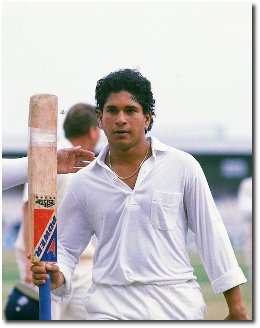
With Sachin Tendulkar having turned 40 (the big 4 O) a few days ago and, numerous articles have been written about his remarkable career. I am a fan of this great cricketer but perhaps not a super-fan like many others who know every statistic and nitty gritty detail. Having lived in Bombay, I was able follow his career from early on due his records set in the Harris Sheild and Giles Shield tournaments. He made his debut back in 1989 at the young age of 16 years and 205 days against India's arch-rival Pakistan in Karachi and announced his retirement from ODI at the end of 2012.
As I was reminiscing about his career, I felt the desire to write something but any article on his stats, career, style and achievements had already been written. Perhaps it in the geek in me that felt I should write an article about how technological advancements in the 24 years since his international debut back, helped me follow his career. So here is my geeky look back at technology and the Tendulkar era.