2012 London Summer Olympics Logo - Design and History
- Details
- Parent Category: History of Logos
- Category: Olympics Logos
- Hits: 9277
 |
|
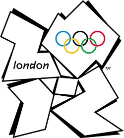
The 2012 Summer Olympic Games, officially the Games of the XXX Olympiad, and also known as London 2012 are scheduled to take place in London, United Kingdom, from 27 July to 12 August 2012. The Olympic games are a major international event in which thousands of athletes from around the globe participate in various sporting events. These include sports such as swimming, track and field, football, basketball and numerous other events. The summer Olympic games are one of the most watched television events and cities around the world compete fiercely to host an Olympic event. |
Controversy : Since the logo was unveiled, there have been a number of controversies surrounding the logo
- Iran said it would boycott the games because the logo appeared to spell the word "ZION", a biblical term that refers to Jerusalem.
- Some have complained that the logo looks like a distorted Swastika.
- Some users complained of having seizures after watching the logo on TV changing colors.
- Perhaps the most absurd one is some users with really wild imaginations have suggested that the 0 is a silhouette of Lisa Simpson performing a sexual act on the number 2. If you look closely, perhaps, but really? Was the logo designer so perverted? Maybe she is just speaking into a microphone.
The logo is fairly simple and uninspiring. London has so many wonderful monuments such as the London Eye, the Buckingham Palace or Big Ben (or Elizabeth Tower as it is now called) that could have been incorporated into the logo. Hopefully the games will be significantly more exciting with Bolt and Phelps in it.
Read more: 2012 London Summer Olympics Logo - Design and History
Olympics Logos - Design
- Details
- Parent Category: History of Logos
- Category: Olympics Logos
- Hits: 14089
 |
The Olympic Games are an international multi-sport event subdivided into summer and winter sporting events. The summer and winter games are each held every four years. Until 1992, they were both held in the same year. Since then, the summer games are held during the first year of an Olympiad, the winter games during the third year.The Olympics date back to ancient Greek times, but the Olympic logo was born in 1913. |
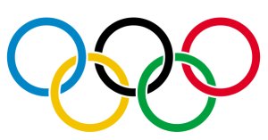
The logo was designed by Frenchmen Pierre de Coubertin for the Paris Congress of the Olympic Movement. The logo was first found on a flag and had five interlocking rings, one for each continent represented in the Olympic Movement (with the Americas being treated as one). The six colors were included as well, black, yellow, blue, red, green, and white. The colors were chosen because at least one of the colors is in the flag of the countries that participate in the Olympics. The reason for the interlocking rings on the Olympic flag is symbolic in showing that the Olympic Games are intended for all nations to be able to come and compete against one another in unity.
2016 Rio Summer Olympics Logo - Design and History
- Details
- Parent Category: History of Logos
- Category: Olympics Logos
- Hits: 12927
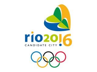 |
On October 2, 2009, Rio De Janeiro was awarded the right to hold the 2016 Summer Olympic games. The logo for the games shown alongside is in the shape of a Sugar Loaf. According to the winning designer, Ann Soter,"The Sugar Loaf in the shape of a heart represents the Brazilians' indisputable passion and vibration for sports. The exclamation point replacing the numeral 1 in the writing 'Rio 20!6' symbolizes Brazil's heightened expectations with the chance of hosting the event". The distinctive shape of the Sugar Loaf is representative of the city's natural assets "cariocas" take so much pride in. The proposed logo is intended to depict the varied colors of Rio's exuberant nature. You can see from the picture of Rio below how the logo ties in with the landscape. The colors Yellow, Green and Blue are also the colors of the Brazilian flag. The logo was chosen from among 4 finalists. |
Read more: 2016 Rio Summer Olympics Logo - Design and History
2010 Vancouver Winter Olympics Logo Design
- Details
- Parent Category: History of Logos
- Category: Olympics Logos
- Hits: 10612
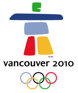 |
The 2010 Winter Olympics, officially the XXI Olympic Winter Games or the 21st Winter Olympics, is a major international multi-sport event held on February 12-28, 2010, in Vancouver, British Columbia, Canada, with some events held in the resort town of Whistler, British Columbia and in the Vancouver suburbs of Richmond, West Vancouver and the University Endowment Lands. The 2010 Winter Olympics shown alongside features a unique design of an inukshuk, a traditional stone sculpture used by Canada's Inuit people, as its official logo. The logo, called Ilanaaq (el la nawk) was designed by local graphic designers Elena Rivera MacGregor and Gonzalo Alatorre. The logo boasts five stone-like formations in green, two in blue, and one in red and yellow. Two pillars serve as the legs in support of the body, a horizontal shape acts as the arm and an eagle is where the head would normally be. The form stands over the words "Vancouver 2010" and the five Olympic rings. |
The different colours represent different regions of the country: the green and blues symbolize coastal forests, mountain ranges and islands. The red represents Canada's Maple Leaf and the yellow depicts the brilliant sunrises. Their emblem was selected by a nine-member panel and beat out over 1,600 other submissions.
2008 Beijing Olympics Games Logo Parody
- Details
- Parent Category: History of Logos
- Category: Olympics Logos
- Hits: 7314
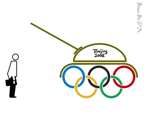
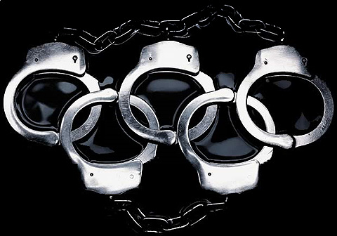
The Beijing Olympics games has attracted its share of controversy because of the fact that the games are being held in China where human rights issues are considered to largely ignored. This has led to a lot of creative logo parodies. Here are two more....they speak for themselves
