World Series 2011 Logo Design
- Details
- Parent Category: History of Logos
- Category: MLB Logos
- Hits: 11374
 |
The World Series is the annual championship series of Major League Baseball, played between the American League and National League champions since 1903. The winner of the World Series championship is determined through a best-of-seven playoff and awarded the Commissioner's Trophy. The 2011 World Series will be the 107th edition of Major League Baseball's championship series. The best-of-seven playoff will be played between the American League champions and the National League champions. The 2011 World Series will begin on October 19. |
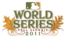
Every year, the World Series logo changes based on a theme of some sort. The 2011 World Series logo is based on the Fall season theme. The World Series logo shows leaves on either side of the logo in their brown fall colors. It appears that leaves are different on either side of the logo. The one of the left, looks like the Canadian Maple leaf while the other side has a different leaf (not sure what leaf). The MLB comprises of teams from both countries so its likely the logo reflects that. The World Series, also referred to as the Fall Classic, is in the logo for the first time.
The logo is pretty and deviates from many previous World Series logos that focus on baseball themes like the diamond, the bats and balls. The 2011 logo uses a predominantly Fall theme which is a first. My only gripe against this logo is that the colors are rather dull. Fall in many parts of the US has such wonderful, bright and spectacular colors and the logo does no justice to that. This logo looks so old and faded that I am not tempted to buy any memorabilia should my team, the Texas Rangers, make it to the World Series (they are up 2-0 in the ALCS) as I write this.
Unlike the NFL, where the location of the Super Bowl is determined 3 years in advance, the World Series is played at the grounds of the two finalists so its hard to incorporate those aspects.
You can find a collection of all the previous World Series logos here.
World Series Logos - Design and History
- Details
- Parent Category: History of Logos
- Category: MLB Logos
- Hits: 16031
 |
The World Series of Baseball begins today between the Boston Red Sox and the Colorado Rockies. The World Series of baseball is played between the American League and National League champions. The Series winner is determined through a best-of-seven playoff (except in 1903, 1919, 1920 and 1921 when the winner was determined through a best-of-nine playoff) and is awarded the World Series Trophy. The World Series has been an annual event since 1903. The World Series logo was introduced in 1974 and has been through many changes over the years. You can see all the logos from 1974 till 2007. |
Colorado Rockies Logo - Design and History
- Details
- Parent Category: History of Logos
- Category: MLB Logos
- Hits: 14184
 |
The Colorado Rockies are a Major League Baseball team based in Denver, Colorado. They are in the West Division of the National League. The team is named after the Rocky Mountains, which pass through Colorado, just west of Denver. They play their home games at Coors Field. The Colorado Rockies were born in 1993 and are a young team compared to some of the big teams like the Yankees and Red Sox. The team is currently in the 2007 Baseball World Series facing the Boston Red Sox. |
The logo is a fairly simple logo and reflects everything that baseball and Colorado represents. The snow-capped Rockies are in the background with a baseball in motion. The team and uniform colors are Black, Purple, Silver, and White. The logo and the text are in the team colors.