Hertz Corporation Logo - Design and History
- Details
- Parent Category: Travel Logos
- Category: Car Rental Company Logos
- Hits: 18975
 Hertz Corporation 2009 Logo |  Hertz Corporation Old Logo |
The Hertz Corporation (also known as Hertz Rent a Car or simply Hertz) is the largest car rental brand in the world, with approximately 3,500 locations in the United States and 7,500 worldwide. It is headquartered in Park Ridge, New Jersey, United States. The company was begun by Walter L. Jacobs in 1918, who started a car rental operation in Chicago with a dozen Model Ts. In 1923, Jacobs sold it to John D. Hertz, president of Yellow Cab and Yellow Truck and Coach Manufacturing Company, who renamed it the "Hertz Drive-Ur-Self System". The company has passed through a number of hands, including General Motors, RCA, and United Airlines. As a public company, Hertz was traded on the NYSE under the symbol HRZ until the purchase of outstanding stock by Ford Motor Company in 1994.
Hertz's new logo leverages their signature yellow color, signifying the Company's 91-year legacy of service and innovation. In the previous logo, the font was in Yellow, but with the new logo, the Yellow color is even more prominent With a contemporary look, the logo also symbolizes Hertz's commitment to remain relevant to today's car and equipment rental customers. The new font is more contemporary with rounded edges as opposed to the old font which is more block-shaped.
According to Mike Senackerib, Hertz Chief Marketing Officer, "Our goal in the logo redesign was to create a more contemporary corporate image that reflects our strong brand recognition, and is in touch with the mindset of current and future customers who appreciate superior service, personalized choices and value. We believe, and our customer research bears out, that the new logo portrays Hertz as a modern brand with personality for business, leisure and insurance replacement renters, and equipment rental customers."
As part of its rebranding, Hertz will be also updating its worldwide facilities, including on-and-off-airport Rent-a-Car and equipment rental locations consistent with the corporate identity.
The logo was design by Landor.
Mazda Logo - Design and History
- Details
- Parent Category: Travel Logos
- Category: Car Logos - Design and History
- Hits: 29089
Mazda Motor Corporation is a Japanese automotive manufacturer based in Hiroshima, Japan. It is said that Mazda coincides with the anglicized pronunciation of the founder's name, Jujiro Matsuda, who was interested in spirituality, and chose to rename the firm in honor of both his family and Zoroastrianism. The word Mazda derives from Ahura Mazda, the Avestan language name for a divinity exalted by the ancient Iranian prophet Zoroaster, as the source of wisdom, intelligence and harmony.
The current logo attempts to capture the spirit of Mazda, the stylised "M" evokes an image of wings in flight and symbolises the Mazda's flight toward the future. The "V" in the centre of the "M" spreads out like an opening fan, representing the creativity, vitalty, flexibilty and passion that is Mazda. The symbol as a whole expresses the sharp, solid feeling that Mazda will be seeking in all of its products. The dynamic circle symbolises our readiness to spread our wings as we enter the 21st century.
Volvo Logo - Design and History
- Details
- Parent Category: Travel Logos
- Category: Car Logos - Design and History
- Hits: 20966
The Volvo Group is a Swedish supplier of commercial vehicles such as trucks, buses and construction equipment, drive systems for marine and industrial applications, aerospace components and financial services. Volvo was founded on 14 April 1927 in the city of Gothenburg, as a spin-off from the roller ball bearing maker SKF.
The name Volvo means "I roll" in Latin and is derived from the Latin word "volvere" which means "to roll". The name originated from the original company that manufactured bearings for the car industry. The logo for Volvo is the ancient symbol of Iron, which is a circle with an arrow pointed diagonally upwards to the right. This symbol also represented "Mars, the God of War" and also the symbol for "Man" as well. Volvo cars are also traditionally known for the safety features. The iron symbol was used to also reflect the strong tradition of th Swedish Iron Industry along with its properties such as safety, quality and durability. The name of the car "Volvo" also runs across the logo against a blue background.
The Volvo car and brand was sold to Ford in 1999.
Abarth Logo - Design and History
- Details
- Parent Category: Travel Logos
- Category: Car Logos - Design and History
- Hits: 21403
Abarth is an Italian racing car maker founded by Italian-Austrian Karl (Carlo) Abarth in Turin in 1949. Abarth was sold to Fiat on July 31 1971, and the racing team sold to Enzo Osella. Abarth became the racing department of Fiat, managed by famed engine designer Aurelio Lampredi.
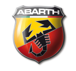
The Abarth logo consists of the following key elements
- The shape of the logo represents a shield which symbolizes the notion of victory. You can find some of the other racing logos like Porsche also have a shield in their logo.
- The red, white and green represent the colors of the Italian Flag.
- The scorpion is the key part of the logo and represents the astrological sign of Karl Alberto Abarth who was born on November 15th 1908.
- The red and yellow colors apparently represent the racing world.
Pontiac Logo - Design and History
- Details
- Parent Category: Travel Logos
- Category: Car Logos - Design and History
- Hits: 29233
Pontiac is a brand of automobiles first produced in 1926, and sold in the United States, Canada and Mexico by General Motors (GM), marketed as an "athletic" brand specializing in mainstream performance vehicles.
The Pontiac brand was introduced by General Motors in 1926 as the 'companion' marque to GM's Oakland Motor Car line. The Pontiac name was first used in 1906 by the Pontiac Spring & Wagon Works. The name was taken from Chief Pontiac, an American Indian chief who led an unsuccessful uprising against the British shortly after the French and Indian War. The Oakland Motor Company and Pontiac Spring & Wagon Works Company merged in November 1908 under the name of the Oakland Motor Car Company. The operations of both companies were joined together in Pontiac, Michigan (of Oakland County) to build the Cartercar. General Motors in 1909 purchased Oakland.
The original logo was that of an American Indian headdress, which was used as a logo until 1956. The American Indian headdress is obviously connected to Chief Pontiac referenced earlier. This was updated to the currently used American Indian red arrowhead design for 1957. The arrowhead logo is also known as the Dart. The logo has a distinctive Red and a silver star in the middle. I am not sure what the significance of the star is but a lot of the Native American art contains elements of nature such as the sun, moon and stars.
On April 27, 2009, amid ongoing financial problems and restructuring efforts, GM announced that it would phase out the Pontiac brand by the end of 2010 and focus on four core brands in the U.S.: Chevrolet, Cadillac, Buick, and GMC.
Hotel Logos Article Count: 2
This section contains details of the design and history of some of the popular hotel logos. If you have any information about the history of some these logos, please contact me.
Airport Logos Article Count: 1
More and more airports around the world are rebranding and positioning themselves as businesses or corporations. This section contains details of the design and history of some of the popular airport logos. If you have any information about the history of some these logos, please contact me.
Online Travel Agency Logos Article Count: 1
Car Rental Company Logos Article Count: 1
Car Logos - Design and History Article Count: 28
Most people are fascinated by fast moving cars and want to own these cars. This section of the website covers the design and history of some of the most famous car logos such as the Ferrari Logo, the Lamborghini logo and the common logos such as the Toyota Logo and the Ford logo. I hope you find this section of the website informative. If you have a recommendation for a logo, please send me a note.Â
Â
Airline Logos Article Count: 8
There are over 1500 airlines in the world today and while its hard to list the history of each airlines, I will attempt to uncover the history and meaning of some of the most well known airlines in the world in this section of the history of logos. I do not wish to make this section into a laundry list of logos with no information. I hope to have articles here that have some real content. If you have any information about the history of some airline logos, please contact me.
Monument Logos Article Count: 1
A lot of monuments and other tourist attractions have become mini corporations and have their own logos. This category on my site aims to discuss the design of these logos. If you have any information about the history of some these logos, please contact me.
