Miami Heat Logo - Design and History
- Details
- Parent Category: History of Logos
- Category: NBA Logos - Design and History
- Hits: 30439
The Miami Heat are a professional basketball team based in Miami, Florida, United States. The Heat were formed in 1988 as an expansion franchise along with the Charlotte Hornets and they along with the Orlando Magic are the only two NBA franchises to represent the state of Florida. The Miami Heat have had some up and down years through their life in the NBA and finally won the Championship in 2006 defeating the Dallas Mavericks. In 2010, the Heat shot into the limelight by signing LeBron James and Chris Bosh to join Dwanye Wade creating what they believe will be a multi-Championship winning team (some call them the Heatles, while others called them the cHeats)
The origin of the name Heat are sketchy but obviously reflects the year-round hot/warm weather of Miami. It is said that the name was selected in some type of contest.
The logo is pretty simple and shows the follow main elements
- A basketball on fire going through a basketball hoop.
- The T on the word Heat also shows a little flame on the top
- The color red is the prominent color on the logo and is also the color of their jerseys
New Orleans Pelicans Logo - Design and History
- Details
- Parent Category: History of Logos
- Category: NBA Logos - Design and History
- Hits: 28330
 |
The New Orleans Hornets are a professional basketball team based in New Orleans, Louisiana. They play in the Southwest Division of the Western Conference of the National Basketball Association. The franchise began play during the 1988€“89 NBA season as the Charlotte Hornets, based in Charlotte, North Carolina, where they were located for fourteen seasons. Following the 2001€“02 season, the team relocated to New Orleans, becoming the New Orleans Hornets In January 2013, the Hornets announced that they would change their name to the New Orleans Pelicans from the 2013-14 NBA season. The new name is taken from Louisiana's state bird, the Brown Pelican. With the new name also came a new logo - a menacing pelican holding a basketball in a blue, gold and red color scheme. On closer inspection of the logo, there are a number of distinct elements of the logo and I will discuss the aspects that I have been able to read and pick up on
|
After moving from Charlotte and being displaced for a while, the team may have lost its identify. In order to give the team its identity back, the new logo and name change is warranted and I feel is a good change for the team. The logo is nice and colorful, identifies well with the state and city and certainly a step up from the currently boring white and teal colors of the Hornets. The team has a future superstar in Anthony Davis, who may be a long term player for them. Having his era start with a new branding is a step in the right direction and may be the dawn of a championship winning team.
Oklahoma City Thunder Logo - Design and History
- Details
- Parent Category: History of Logos
- Category: NBA Logos - Design and History
- Hits: 11808
 |
The Oklahoma City Thunder are a professional basketball franchise based in Oklahoma City, Oklahoma. They play in the Northwest Division of the Western Conference in the National Basketball Association. Formerly known as the Seattle SuperSonics, the team relocated to Oklahoma City in 2008. Shortly after announcing the move to Oklahoma City, the team announced their name as the "Thunder" and unveiled their logo. Since the team was moved to OKC, the team has had a good run of success in 2011 and 2012 with its stars like Kevin Durant, James Harden and Russell Westbrook.
- Light Blue which is the color found on the Oklahoma state flag 3. The letters, OKC - Oklahoma City and the team name 'Thunder' are quite prominent and use the dark blue color |
The name Thunder was the most popular choice for the team logo, primarily because of the powerful storms that occur in the area know as Tornado Alley. Wind, Barons, Marshalls, Energy and Bison were some of the names under consideration.
Overall the logo is quite plain and does not make me go "Wow". The logo does not have anything obvious to represent the state or the city (like the Denver Nuggets logo shows the snow capped peaks). It does not have anything to represent the Thunder, except perhaps the orange and blue streaks that look like Lightening.
Other notes on the logo
- The Thunder worked with Ackerman-McQueen, Oklahoma City, and the NBA to develop the logo.
- The logo was launched with the AC/DC's big hit Thunderstruck".
Brooklyn Nets Logo - Design and History
- Details
- Parent Category: History of Logos
- Category: NBA Logos - Design and History
- Hits: 17139
 |
|
The Brooklyn Nets are a professional basketball team based in the New York City borough of Brooklyn. They are members of the Atlantic Division of the Eastern Conference in the NBA. The team is one of two NBA franchises playing in New York City, along with the New York Knicks. Popular rapper and businessman Jay-Z is also a part owner of the Brooklyn Nets. The Brooklyn Nets were called the New Jersey Nets until the end of the 2011-2012 NBA season after which they were relocated to Brooklyn, NY. In May 2012, the Nets unveiled two logos for their organization, a primary and a secondary logo. The new primary logo retains the shield from its New Jersey Nets logo but adds the 'B' for Brooklyn. The basketball has been on every logo of the franchise since 1967 when they were called the New Jersey Americans. This logo continues that traditional as well. Brooklyn is also displayed prominently at the bottom to round out the design of the primary logo. The secondary logo, takes off from the primary logo by retaining the basketball and the B, but "Brooklyn" and "New York" surround the ball. The logos have been designed by Jay Z and will have a black-and-white color scheme, which apparently pays homage to the old New York subway signage system. |
Overall, the approach taken by the Brooklyn Nets is quite different because they have gone with a Black and White theme which make make it hard to put the logo on certain colors. However the Black and White combination can also be used quite effectively due to its striking contrast. No NBA team has B/W uniforms but many soccer teams use B/W uniforms and they look sharp. Time will tell how the logo will be received. Hopefully, the Brooklyn Nets will have more success than the NJ Nets.
2012 NBA All-Star Game
- Details
- Parent Category: History of Logos
- Category: NBA Logos - Design and History
- Hits: 11053
 |
The 2012 NBA All-Star Game is an exhibition basketball game between players selected from the league's Western Conference and the Eastern Conference that will be played on February 26, 2012 at the Amway Center in Orlando, Floria. The game will be the 61st edition of the National Basketball Association (NBA) All-Star Game and will be played during the 2011€“12 NBA season. Orlando will hosting the event for the 2nd time in its history. |
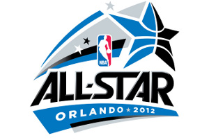
The Logo for the event is shown above and the following are some of the key elements in the logo.
- The key aspect of the logo is the shooting star in light blue and black colors, which are also the primary colors of the Orlando magic logo. The Star is prominent to reflect the "All Star" Game.
- The Star has the pattern and shape of the basketball as well.
- The big Star also has a 3 small stars on it which have been taken from the Orlando Magic logo (perhaps to reflect the magic of Disney)
- The All Star font is very not the same as the one used by the Magic but does remind me of something that I am unable to pin down as I write this post.
- The location - Orlando 2012 is also prominent at the bottom and the NBA logo is thrown in the middle.
Overall, its a very ordinary logo. The logo does not reflect much about the city of Orlando (except perhaps the Disney magic stars). The colors are fairly dull as well. Hope the game, dunk contest and other events are more entertaining than the logo.
See the history and design of some NBA Logos.