Yonex Logo Design
- Details
- Parent Category: History of Logos
- Category: Sports Logos
- Hits: 27998

| Yonex Co., Ltd. is a Japanese manufacturer of sporting equipment for badminton, golf and tennis, producing racquets, clubs, shoes, shuttlecocks, and other equipment for those sports.The company was founded in 1946 by Minoru Yoneyama as a producer of wooden floats for fishing nets. The company was later forced out of this market because of the invention of plastic floats. In 1957, Yoneyama began to make badminton racquets for other brands. Over the years, the company has grown to be world's biggest badminton company. Despite it's shrinking market share in badminton, Yonex remains the biggest badminton company in the world. Yonex provides clothing for numerous national badminton associations around the world, such as the Malaysian Badminton Association, Badminton Scotland, Badminton England, Badminton Ireland and Badminton Wales. The Yonex logo has always intrigued me in the simplicity of its design. The logo effectively uses the triangle and the circle shapes to create a YY for Yonex (or perhaps Yoneyama). The triangle with the circle at the bottom could also be thought of as the shuttle used in the game of badminton, but maybe that's my imagination. The standard logo is set on a blue and green background with white text but I have also seen a black and white logo as well. The YY logo is also very distinct on the badminton & tennis racquets as well. Growing up, it was a dream to own a Yonex badminton racquet. I still love the logo after all these years. |
2009 UEFA Womens Euro Logo Design
- Details
- Parent Category: History of Logos
- Category: Sports Logos
- Hits: 16679
 |
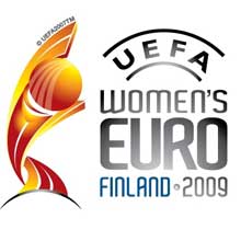
The 2009 UEFA Women's Championship, or just Women's Euro 2009, is being played in Finland between August 23 and September 10, 2009. Twelve teams compete in the competition, increase of 4 teams from 8 teams that played in previous tournaments. The logo of the championship was unveiled in Feb 2008 and is shown alongside. The logo, which is a mix of bright yellow and orange is in the shape of a person with the head shaped as a ball. The colour palette usage, from light yellow to dark orange, encompasses passion, pride and a sense of a new dawn within the competition. At the same time, the heritage and prestigious past of this tournament is maintained via the use of the distinctive UEFA arch. Beneath the main graphic element and the tournament wording, the host country staging the finals is also referenced, in this case "FINLAND 2009". |
NCAA Final Four Logo - Design and History
- Details
- Parent Category: History of Logos
- Category: Sports Logos
- Hits: 19665
 |
The 2008 NCAA Men's Division I Basketball Tournament involves 65 schools playing in a single-elimination tournament to determine the national champion of men's NCAA Division I college basketball. It began on March 18, 2008, and will conclude with the championship game on April 7 at the Alamodome in San Antonio, Texas. The entire event is also known as "March Madness" and is probably one of the most watched TV events in the US. The host institution this year will be the University of Texas at San Antonio. |
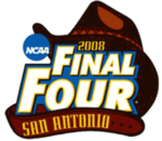
The Final Four logo represents the aspects of the city of San Antonio where the event is being held. The city, also known as the Alamo city, is famous for its cowboy culture and the 2008 Final Four logo represents that part of the event. The logo comprises of a big cowboy hat and a matching cowboy belt, that is wrapped around the name of the event "2008 NCAA Final Four". The belt has the name of the host city. The logo was unveiled in San Antonio in September 2006.
SuperBowl XLII Logo Design
- Details
- Parent Category: History of Logos
- Category: Sports Logos
- Hits: 29713
 |
SuperBowl XLII is finally upon us, its the undefeated New England Patriots vs the New York Giants. With SuperBowl XLII right around the corner, I thought it would be apt to look at the various SuperBowl logos. The SupwerBowl is the championship game in the NFL and is played between the winner of the National Football Conference (NFC) and the American Football Conference (AFC). The SuperBowl is probably the most watched television event in the United States. |
The SuperBowl logo varies each year and typically has something in it to represent the city where the game is being played. SuperBowl XXI and XXVII were played at the Rose Bowl in Pasadena and so have a touch of rose in the logo.
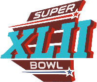
The Super Bowl XLII logo was also unveiled, featuring the shape of the state of Arizona in red. The two horizontal white stripes in the middle represent the vertical lines on the University of Phoenix Stadium. The turquoise Roman Numerals represent the Native American culture of Arizona. The red star represents the AFC and the blue star represents the NFC.
See all the SuperBowl Logos here.
LPGA Logo - Design and History
- Details
- Parent Category: History of Logos
- Category: Sports Logos
- Hits: 23528
 |
The LPGA, the Ladies Professional Golf Association, is an American organization for female professional golfers. The organization, with headquarters in Daytona Beach, Florida, is best known for running the LPGA Tour, a series of weekly golf tournaments for elite female golfers from around the world which runs from February to December each year. In 2007 prize money on the LPGA Tour is USD $54.285 million. The LPGA Tour unveiled a new logo in October 2007. The new logo, the first redesign since 1992 of its classic "swinging lady," features a red, white, green, blue and yellow collection of seven strokes that form a female golfer at the end of her follow through. The golfer is positioned above bold letters that spell out LPGA. The new logo "represents the power, strength and athleticism of our LPGA athletes," LPGA commissioner Carolyn Bivens said in a press release. |