Sports Logos
2016 Summer Olympics Logos - Design
- Details
- Parent Category: History of Logos
- Category: Sports Logos
- Hits: 20524
 |
Cities around the world are bidding to host The 2016 Summer Olympics. The host city will be announced at the 121st IOC Session to be held in Copenhagen, Denmark, on October 2, 2009. The 2016 Summer Paralympics will also be held in the same city and organized by the same organizing committee. The following cities are currently in the running. Some of these cities have recently unveiled their logos. The meanings behind these logos described below. |
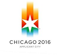 |
Chicago - United States The Chicago logo's central element is the Chicago star, a symbol that adorns the city flag. The six points on the star represent hope, respect, harmony, friendship, excellence and celebration. The colors of the star appear to represent the colors of the Olympics. "A star tells a story of hope, universally seen as a guiding light for people everywhere, |
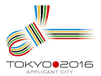 |
Tokyo - Japan The Tokyo 2016 logo takes the form of a traditional Japanese knot known as €œMUSUBI€. It integrates the five Olympic colours into a motif of colourful and decorative knotted strings which have long been utilised in Japan to signify blessings during times of celebration. "This logo, our MUSUBI knot, integrates the values that underpin both the Olympic Movement and Tokyo 2016. It ties together sport and culture, urban and natural environment, Japan and the world, the world and peace" - Organizers |
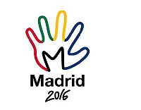 |
Madrid - Spain The Madrid logo is in the shape of the palm of a hand painted in the colors of the Olympic movement. The design features a cartoon hand traced in the colors blue, yellow, green and red with an M drawn into the palm in black over "Madrid 2016." The hand is a symbol to welcome foreigners to the city and its people, with the colors representing the nationalities and cultures living within the city, according to the Madrid committee.
|
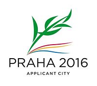 |
Prague - Czech Republic The Prague logo's design builds on the Antique tradition - olive branch for the Olympic winner. The branch is made out of five stylised green leaves with shadow in a form of wind born ribbons. Each of these elements has its own meaning. The branch has 5 symbolic leaves - matching the number of Olympic circles. Each of the leaves stands for one continent. Altogether the five leaves symbolise the five continents to create a symbolic map of the sports world. It is a tribute to the athletes from all around the world. The upper ribbons, below the branch, are in the colours of Prague: red and yellow. Below them is a blue ribbon which stands for the river Vltava that flows through Prague. The entire design should evoke movement. Together with the black text PRAHA there are 5 Olympic colours: blue, black, red, yellow and green." The original logo consisted of green numbers in the year 2016 shaped like a laurel branch as a symbol of victory. The Olympic Committee asked that the logo be changed. |
 |
Rio de Janiero, Brazil The Rio De Janiero logo at this point does not seem to have a full designed logo except for the text Rio 2016 in Green. Hopefully a better |
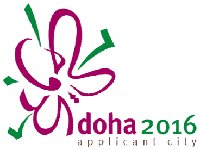 |
Doha, Qatar The Doha 2016 Olympic bid committee has revealed its campaign logo which is a green and purple representation of an aldahma flower. The Aldahma €“ the €˜Flower of the Spring€™ €“ was chosen to represent the vital and energetic spirit of the season. The Aldahma€™s natural habitat in the sands of the desert draws a parallel with the vibrant and colourful life flourishing in the State of Qatar. The calligraphy strokes making the words €˜Doha 2016€™ are a unique manipulation of the traditional organic Henna patterns that women use to adorn their hands and arms as part of social and holiday celebrations. The dynamic interaction between the Arabic calligraphy and the English type is an interpretation of modernity. The committee also revealed that the tagline would be "celebrating change". |
The other two cities in the running are Baku, Azerbaijan and Doha, Qatar. These two cities are yet to unveil an official logo.
Sources:
http://en.wikipedia.org/wiki/2016_Summer_Olympics
http://www.tokyo2016.or.jp/en/news/whatsnew/information/logo.html
http://www.praha2016.org/olymp/jnp/en/news/Applicant_Logo_Modified.html
See more World Famous Logos
Technology Logos
Car Logos
Logo Parodies