The North Face Logo - Design and History
 |
The North Face, Inc. is an outdoor product company specializing in high-end outerwear, fleece, footwear, and equipment. The clothing and equipment lines are catered towards climbers, mountaineers, skiers, snowboarders, hikers, and endurance athletes.The clothing line is famous for its use on mountaineering expeditions on Mt. Everest and in other extreme outdoor activities. |
The North Face brand was established in 1968, in San Francisco, California, when Douglas Tompkins and Kenneth "Hap" Klopp created an equipment retail store that eventually acquired the current name "The North Face". This name was chosen because the north face of a mountain in the northern hemisphere is generally the steepest, coldest, and most difficult face to climb.
The North Face's easily recognizable logo consists of a slightly skewed quarter-circle with two lines running within it. This image is supposedly an interpretation of the famous Half Dome rock formation in Yosemite National Park. Adjacent to the symbol are the words THE NORTH FACE embroidered in large block letters.
Lacoste Logo - Design and History
 |
Lacoste is a French apparel company founded in 1933 that sells clothing, footwear, perfume, leather goods, watches, eyewear, and most famously, tennis shirts. The Lacoste company was founded in 1933 and takes its name from Rene Lacoste, the world-renowned tennis player and sports enthusiast. Rene Lacoste did not like the traditional shirts used for tennis and teamed up with Andre Gillier, the owner of France's largest knitwear company, to create the knitted cotton pique shirt that revolutionized the sportswear market. |
The American press nicknamed Rene Lacoste the "Crocodile" after he made a bet with the Captain of the French Davis Cup team. He had promised Rene a crocodile skin suitcase if he won a match that was important to the team. The American public stuck with this nickname that highlighted Rene's tenacity on the tennis court. A friend of Rene's, Robert George, drew a crocodile that was embroidered on the blazer that he wore on the court from then on.
2008 Republican National Convention Logo
 |
The Republican National Convention will be held in Mineapolis-Saint Paul between September 1-4, 2008. The convention is held during the election year. The National conventions combine three important functions:
|
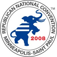
The party officials and convention organizers unveiled the Convention logo. The logo features the silhouette of a triumphant elephant, a Party symbol dating back to 1874, along with the names of the host cities of Minneapolis and Saint Paul. The back of the elephant has the stripes of the flag, the eye is one of the stars from the flag and the 2008 is in Red. The circle around the logo shows the name of the host cities, Minneapolis and Saint Paul.
Major League Soccer - MLS Logos
 |
Major League Soccer (MLS) is a professional soccer league with teams from the United States and Canada. It is sanctioned by the professional divisions of both the United States Soccer Federation (USSF or U.S. Soccer) and the Canadian Soccer Association (CSA), which are both members of FIFA. In 2007, The league comprised of 13 teams are split into two conferences, the Western Conference has six teams, while the Eastern Conference has seven, including the league's newest addition, Toronto FC. The season typically runs from April to November each year. |
The league has been growing in popularity over the last few years and generated a lot of buzz in 2007 with the addition of David Beckham to the LA Galaxy lineup. The section of the website lists the logos of these teams.
Amazon.com Logo - Design and History
 |
Amazon.com is a pioneer in the online retailing business. The company was founded by Jeff Bezos in 1994 and began as an online book store. However today Amazon sells anything and everything under the sun including CDS, DVD, Baby Products, Furniture, electronics, clothes etc. You could say that they sell everything from "A to Z". |
The Amazon logo represents the very same message that they sell everything from A to Z and the arrow below the logo represents the smile that customers would experience by shopping on the Amazon.com website.
Seattle Space Needle Logo - Design and History

The Space Needle is Seattle is a landmark is Seattle. The Space Needle is a tower that measures about 605 ft from its base to the tip. The Space Needle was built in 1962. I was intrigued by the logo of the Space Needle on a recent trip to Seattle.
p>
The logo consists of an S at the top which represents Seattle. The top part of the S is smaller that the bottom part of the S to represent the shape of the tower itself. The top of the S also has a pointed needle. Two strokes of the brush are present at the bottom of the S to represent the tower. The text "space needle" is written in lower case on either side of the logo. I felt this is a very creative logo.