World Series Logos - Design and History
 |
The World Series of Baseball begins today between the Boston Red Sox and the Colorado Rockies. The World Series of baseball is played between the American League and National League champions. The Series winner is determined through a best-of-seven playoff (except in 1903, 1919, 1920 and 1921 when the winner was determined through a best-of-nine playoff) and is awarded the World Series Trophy. The World Series has been an annual event since 1903. The World Series logo was introduced in 1974 and has been through many changes over the years. You can see all the logos from 1974 till 2007. |
Can Boston have 3 titles by the Summer?
 |
Winning a "World Championship" title in the United States Professional sports leagues is pretty tough. The leagues are extremely competitive and its hard for clubs to get repeats or even three-peats, but some of the clubs actually do. The Bulls, Patriots, Lakers and the Yankees are some of the clubs that come to mind in the recent 10 years. Its very rare to have two teams from the same city hold the title of World Champions at the same time. At this time, the NFL title is with the Indianapolis Colts, the NBA title with the San Antonio Spurs and the MLB title with the St Louis Cardinals. Three very different locations and none of them even major US cities. |
This is possibly the first time, I can see three teams from the same city holding the title of "World Champions" at the start of summer. That city would be Boston.
1. The Boston Red Sox are in the World Series once again playing the Colorado Rockies and stand a great chance of winning the MLB tilte of World Champions.
2. The New England Patriots are clearly the hottest team in the NFL. They are one two unbeaten teams (the Colts being the other team). They are currently scoring at an average of over 40 points/game (which is very tough in the NFL). Some are even predicting that this is the Greatest Offense of all time. The combination of Brady and Moss is just lethal. They do stand a great chance of winning the title if they can maintain this pace and remain healthy.
3. The Boston Celtics have a rich history of winning NBA titles, but the team has not done very well in the past two decades. In the off-season, the Celtics made some blockbuster deals getting Kevin Garnett, Ray Allen and James Posey. The Celtics have the least chance of the three teams but two out of three ain't bad.
Lets see what happens. Check back in June.
Colorado Rockies Logo - Design and History
 |
The Colorado Rockies are a Major League Baseball team based in Denver, Colorado. They are in the West Division of the National League. The team is named after the Rocky Mountains, which pass through Colorado, just west of Denver. They play their home games at Coors Field. The Colorado Rockies were born in 1993 and are a young team compared to some of the big teams like the Yankees and Red Sox. The team is currently in the 2007 Baseball World Series facing the Boston Red Sox. |
The logo is a fairly simple logo and reflects everything that baseball and Colorado represents. The snow-capped Rockies are in the background with a baseball in motion. The team and uniform colors are Black, Purple, Silver, and White. The logo and the text are in the team colors.
Tour De France Logo Design
 |
The Tour de France is an annual bicycle race held in in France and nearby countries. First staged in 1903, the race covers more than 3,600 kilometres and lasts three weeks. As the best known and most prestigious of cycling's three "Grand Tours", the Tour de France attracts riders and teams from around the world. The race is broken into day-long segments, called stages. Individual times to finish each stage are aggregated to determine the overall winner at the end of the race. The rider with the lowest aggregate time at the end of each day wears a yellow jersey. The course changes every year, but the race has always finished in Paris. The Tour De France Logo in my mind, is quite brilliant. If you don't observe closely, it will seem like a poorly designed logo with some funny font but if you watch it carefully, you will see the beauty of the design (not everyone may agree). The key aspects are described below. 1. The O, U and the R along with the Yellow circle are in the shape of a cyclist riding a cycle. 2. The Yellow circle helps complete the circle but also represents the "Yellow" in the "Yellow Jersey" which is handed to the leader at the end of each day. If you don't see the cycle in the logo the first time, it may seem like a logo with some clumsy fonts but once you see the cycle, it seems rather brilliant.
|
See more World Famous Logos
Technology Logos
Car Logos
Logo Parodies
LPGA Logo - Design and History
 |
The LPGA, the Ladies Professional Golf Association, is an American organization for female professional golfers. The organization, with headquarters in Daytona Beach, Florida, is best known for running the LPGA Tour, a series of weekly golf tournaments for elite female golfers from around the world which runs from February to December each year. In 2007 prize money on the LPGA Tour is USD $54.285 million. The LPGA Tour unveiled a new logo in October 2007. The new logo, the first redesign since 1992 of its classic "swinging lady," features a red, white, green, blue and yellow collection of seven strokes that form a female golfer at the end of her follow through. The golfer is positioned above bold letters that spell out LPGA. The new logo "represents the power, strength and athleticism of our LPGA athletes," LPGA commissioner Carolyn Bivens said in a press release. |
2016 Summer Olympics Logos - Design
 |
Cities around the world are bidding to host The 2016 Summer Olympics. The host city will be announced at the 121st IOC Session to be held in Copenhagen, Denmark, on October 2, 2009. The 2016 Summer Paralympics will also be held in the same city and organized by the same organizing committee. The following cities are currently in the running. Some of these cities have recently unveiled their logos. The meanings behind these logos described below. |
 |
Chicago - United States The Chicago logo's central element is the Chicago star, a symbol that adorns the city flag. The six points on the star represent hope, respect, harmony, friendship, excellence and celebration. The colors of the star appear to represent the colors of the Olympics. "A star tells a story of hope, universally seen as a guiding light for people everywhere, |
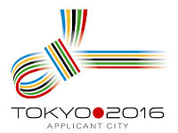 |
Tokyo - Japan The Tokyo 2016 logo takes the form of a traditional Japanese knot known as €œMUSUBI€. It integrates the five Olympic colours into a motif of colourful and decorative knotted strings which have long been utilised in Japan to signify blessings during times of celebration. "This logo, our MUSUBI knot, integrates the values that underpin both the Olympic Movement and Tokyo 2016. It ties together sport and culture, urban and natural environment, Japan and the world, the world and peace" - Organizers |
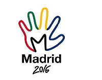 |
Madrid - Spain The Madrid logo is in the shape of the palm of a hand painted in the colors of the Olympic movement. The design features a cartoon hand traced in the colors blue, yellow, green and red with an M drawn into the palm in black over "Madrid 2016." The hand is a symbol to welcome foreigners to the city and its people, with the colors representing the nationalities and cultures living within the city, according to the Madrid committee.
|
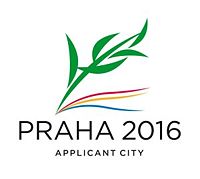 |
Prague - Czech Republic The Prague logo's design builds on the Antique tradition - olive branch for the Olympic winner. The branch is made out of five stylised green leaves with shadow in a form of wind born ribbons. Each of these elements has its own meaning. The branch has 5 symbolic leaves - matching the number of Olympic circles. Each of the leaves stands for one continent. Altogether the five leaves symbolise the five continents to create a symbolic map of the sports world. It is a tribute to the athletes from all around the world. The upper ribbons, below the branch, are in the colours of Prague: red and yellow. Below them is a blue ribbon which stands for the river Vltava that flows through Prague. The entire design should evoke movement. Together with the black text PRAHA there are 5 Olympic colours: blue, black, red, yellow and green." The original logo consisted of green numbers in the year 2016 shaped like a laurel branch as a symbol of victory. The Olympic Committee asked that the logo be changed. |
 |
Rio de Janiero, Brazil The Rio De Janiero logo at this point does not seem to have a full designed logo except for the text Rio 2016 in Green. Hopefully a better |
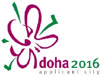 |
Doha, Qatar The Doha 2016 Olympic bid committee has revealed its campaign logo which is a green and purple representation of an aldahma flower. The Aldahma €“ the €˜Flower of the Spring€™ €“ was chosen to represent the vital and energetic spirit of the season. The Aldahma€™s natural habitat in the sands of the desert draws a parallel with the vibrant and colourful life flourishing in the State of Qatar. The calligraphy strokes making the words €˜Doha 2016€™ are a unique manipulation of the traditional organic Henna patterns that women use to adorn their hands and arms as part of social and holiday celebrations. The dynamic interaction between the Arabic calligraphy and the English type is an interpretation of modernity. The committee also revealed that the tagline would be "celebrating change". |
The other two cities in the running are Baku, Azerbaijan and Doha, Qatar. These two cities are yet to unveil an official logo.
Sources:
http://en.wikipedia.org/wiki/2016_Summer_Olympics
http://www.tokyo2016.or.jp/en/news/whatsnew/information/logo.html
http://www.praha2016.org/olymp/jnp/en/news/Applicant_Logo_Modified.html
See more World Famous Logos
Technology Logos
Car Logos
Logo Parodies