Organization Logos
YMCA Logo - Design and History
- Details
- Parent Category: History of Logos
- Category: Organization Logos
- Hits: 12099
 |
The Young Men's Christian Association (commonly known as "YMCA" or in the USA "the Y") is a worldwide organization of more than 45 million members from 125 national federations affiliated through the World Alliance of YMCAs. The YMCA was founded on June 6, 1844 in London, England by Sir George Williams, the goal of the organization was putting Christian principles into practice, achieved by developing "a healthy spirit, mind, and body." In 2011, the YMCA introduced a brand and logo change going from the "YMCA" to just the "Y". The YMCA unveiled a new, more forward-looking logo that reflects the vibrancy and diversity of the organization, and a framework that focuses resources on three core areas: youth development, healthy living and social responsibility. The new logo, which uses a stylized delta or arrowhead shape plus a triangle to form the letter Y. The new "Y" logo is very contemporary and modern and probably a good choice. The chose is undergoing a change after 43 years and the change is quite major. The old logos have had the triangle theme and the little delta on the top continues that tradition. While the triangle is not so prominent, its still there. The new Y logo comes in a rainbow of five different color combinations, from teal green and blue to red and gold, purple and red and gold and green. |
The complete history of the logo is below.
 |
1881 - The Ninth Conference in London approves the first Y logo, which highlights Y values by featuring a reference to John 17:21: That they may all be one as We are one. |
|
|
1891 - Luther H. Gulick, M.D., proposes a red triangle as the Y symbol. The equal sides of the triangle stand for €œman€™s essential unity, body, mind and spirit, each being a necessary and eternal part of man, he being neither one alone |
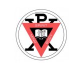 |
1895 - The annual convention of the U.S. and Canadian Ys authorizes adding the triangle to the old World Alliance Insignia. |
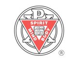 |
1896 - The logo is simplified and a second ring is added. It is said the second ring represents friendship and love without end among individuals. This remains the Y€™s official emblem. |
 |
1897 - The everyday logo from 1897 to 1967 is the red triangle. |
 |
1967 - The Y creates and trademarks the logo with the triangle and bent bar. |
Source: http://www.ymca.net/news-media/y-logo-history.pdf
More World Famous Logos
More Car Logos
Logo Parodies
