Zee TV Logo - Design and History
 |
|
Zee TV is an India-based satellite television channel owned by Zee Entertainment Enterprises based in Mumbai, Maharashtra, which broadcasts various programmes in Hindi and other regional languages of India. Broadcasting is also present in various nations of South Asia, Europe, the Middle East, Africa, East Asia, Australasia and North America. It is a part of the Essel Group. In June 2011, Zee TV unvelied a more stylish and contemporary logo shown above. The new logo of Zee TV is designed in an aqua blue color, featuring a stylish font. The design of the new logo of Zee with its upward flourish represents the upward movement of desires and wishes. The aqua blue color of the Zee TV new logo bring in modernity and freshness to the brand. The new logo of Zee tv has been developed by the Zee in-house team. According to MD & CEO Punit Goenka, "The unshackling of the 'Z' from the box symbolizes the modern woman's zest for life and the confidence she possesses to step out into the world, beyond her home. The overall design has a progressive feel and reflects the idea of looking into the future with hope, depicting a more dynamic and spirited outlook. The rainbow of hope is an important element of the new packaging. It is colorful, ethereal and symbolically emphasizes the promise of 'Umeed Se Saje Zindagi'" said ZEEL managing director and chief executive officer Punit Goenka. |
Yonex Logo Design

| Yonex Co., Ltd. is a Japanese manufacturer of sporting equipment for badminton, golf and tennis, producing racquets, clubs, shoes, shuttlecocks, and other equipment for those sports.The company was founded in 1946 by Minoru Yoneyama as a producer of wooden floats for fishing nets. The company was later forced out of this market because of the invention of plastic floats. In 1957, Yoneyama began to make badminton racquets for other brands. Over the years, the company has grown to be world's biggest badminton company. Despite it's shrinking market share in badminton, Yonex remains the biggest badminton company in the world. Yonex provides clothing for numerous national badminton associations around the world, such as the Malaysian Badminton Association, Badminton Scotland, Badminton England, Badminton Ireland and Badminton Wales. The Yonex logo has always intrigued me in the simplicity of its design. The logo effectively uses the triangle and the circle shapes to create a YY for Yonex (or perhaps Yoneyama). The triangle with the circle at the bottom could also be thought of as the shuttle used in the game of badminton, but maybe that's my imagination. The standard logo is set on a blue and green background with white text but I have also seen a black and white logo as well. The YY logo is also very distinct on the badminton & tennis racquets as well. Growing up, it was a dream to own a Yonex badminton racquet. I still love the logo after all these years. |
VMWare Logo - Design
 |
VMware, Inc. is a US-based company specializing in virtualization software. The company was founded in 1998 and is based in Palo Alto, California. The Company is majority owned by EMC Corporation. The name "VMware" comes from the acronym "VM", meaning "virtual machine", combined with "ware" from the second part of "software". In 2011, VMWare modified their logo a bit and removed the 3 squares that accompanied the log before. The old logo and the reason for the 3 squares is described below.
VMware's desktop software runs on Microsoft Windows, Linux, and Mac OS X. VMware's enterprise software, VMware ESX Server, runs directly on server hardware without requiring an additional underlying operating system.
|
Gift of Bombay Trip
Gift of Bombay Trip - CD Norman, Feb 2011
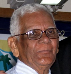
This is a letter of appreciation from Mr CD Norman for the event honouring him on Founder's Day 2011.
 | My trip to Bombay in February 2011 was a gift offered to me and Subhashini by ex-students of Bombay Scottish School, particularly by the students of 1964 batch. It happened in a most unexpected way when I have been hoping for this trip for many years. After retirement from Bombay Scottish School in 1982, I settled in Bangalore from April 1989. I made a brief trip to Bombay in December the same year for two days. I cannot recall what the purpose of the trip was except to collect the refund cheque from Bombay Telephones, of the deposit amount with them. I had surrendered my phone before leaving Bombay. |
Then there was a long wait eagerly hoping for a trip once again to Bombay. The chance came from an unexpected event, almost by an accidental mention of the name of Darius Pedder, an ex student of mine, in my article that appeared in the annual magazine of BSS: €œTartan 2010€ As luck would have it Monica Bose showed the article to Darius in one of the get-together of 64 batch. The matter then started moving fast. On reading through the article in the magazine, Darius wrote to me €œwith his eyes filled with tears€ to say, €œSir, of all your students of BSS, I am happy that you remembered me.€ That article which started with these words, €œDarius was his name. Darius Pedder.€ was to cost him good money, material and time as also a spate of e-mails which brought myself and Subhashini to Bombay for four memorable days, 17 to 20 February 2011.
SuperBowl XLV 2011 Logo Design
 |
Super Bowl XLV will be the 45th annual edition of the Super Bowl in American football, and the 41st annual championship game of the modern-era National Football League (NFL). The game, to be played on February 6, 2011, will pit the champions of the AFC and the NFC and will be held at Cowboys Stadium in Arlington, Texas. This will be the first time that the Super Bowl will be held in the Dallas Fort Worth area (my home town and host to many more Super Bowls we hope) and the fifth time the same city hosting the Super Bowl also hosted a World Series game the preceding autumn. The Super Bowl logos underwent a major change this year and some new rules were introduced to standardize the Super Bowl logos. Starting with the 2011 Super Bowl, the theme of the logo will basically remain the same. The only differences from year to year are the stadium backdrop and the Roman numerals for the game. For this Superbowl, it means the logo displays the Cowboys Stadium in the background with the Vince Lombardi Trophy sitting on top of the Roman numerals for the game. The Super Bowl XLV logo was unveiled for the 2011 game at Cowboys Stadium in Feb 2010. NFL officials looked at eight designs before recently finalizing their choice. |
I am personally not thrilled with this decision by the NFL. If you look at the Super Bowl logos from the past you can see they each had a unique style that represented various aspects of the region, the country, the game etc. Some logos were really well designed and some were cheesy, but that was the fun of it. Going forward, all the logos are going to the equally standardized (read Boring!!!)
See all the SuperBowl Logos here.
See the SuperBowl XLII Logo and the SuperBowl XLI Logo.
Starbucks Logo - Design and History
 |
Starbucks Corporation is a coffeehouse chain based in the United States. Named after a character in the novel Moby Dick, it is the largest coffeehouse company in the world, with over 7500 self-operated and 5500 licensed stores in 39 countries. The current company logo, modeled after a 15th century Norse woodcut, is a mixoparthenos, or "twin-tailed mermaid, or siren as she's known in Greek mythology. The company and the logo have an interesting history. In Jan 2011, Starbucks released a new version of the logo with a couple of big changes and some subtle changes as well. The two major changes made to the logo are
|

