Hollywood Celebrities with Indian Tattoos
Most celebrities often get tattoos and also seem to be mystified by Eastern religions and such as Hinduism, Judaism, Buddhism etc. Besides some elaborate artwork of snakes and dragons, I have also seem them having tattoos in Sanskrit or some east Asian languages. I set out to look for celebrities who have Sanskrit tattoos and was surprised to find quite a few of them. Its not surprising that the most popular Sanskrit tattoo is Om. Om (or Aum) is arguably the most famous symbol of Hindu culture in the west and that probably is why its is so popular.
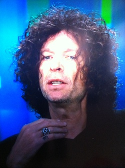
- Howard Stern has an Om tattoo on his hand.
- Katy Perry - have got 'Anuugacchati Pravaha', meaning 'Go With The Flow' inked inside the right arm,
- Russell Brand - also got the same tattoo as Katy Perry when they decided to get married in India in 2010.
- Tommy Lee also has an Om Tattoo on his stomach.
- Alyssa Milano also has a wrist tattoo of the Hindu syllable "Om".
- Sherilyn Fenn, a television star has an Om tattoo on her forearm
- Angelina Jolie has a Sanskrit blessing in the Cambodian language, which she has said is to honor her first adopted son, Maddox.
- David Beckham has the his wife Victoria's name tattooed on his arm.
Olympics Logos - Design
 |
The Olympic Games are an international multi-sport event subdivided into summer and winter sporting events. The summer and winter games are each held every four years. Until 1992, they were both held in the same year. Since then, the summer games are held during the first year of an Olympiad, the winter games during the third year.The Olympics date back to ancient Greek times, but the Olympic logo was born in 1913. |
The logo was designed by Frenchmen Pierre de Coubertin for the Paris Congress of the Olympic Movement. The logo was first found on a flag and had five interlocking rings, one for each continent represented in the Olympic Movement (with the Americas being treated as one). The six colors were included as well, black, yellow, blue, red, green, and white. The colors were chosen because at least one of the colors is in the flag of the countries that participate in the Olympics. The reason for the interlocking rings on the Olympic flag is symbolic in showing that the Olympic Games are intended for all nations to be able to come and compete against one another in unity.
Euro 2012 Logo Design
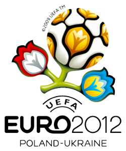 |
The 2012 UEFA European Football Championship, commonly referred to as Euro 2012, will be the 14th European Championship for national football teams sanctioned by UEFA. The final tournament will be hosted by Poland and Ukraine between 8 June and 1 July 2012. It is the first time that either nation has hosted the tournament. The logo for the tournament shown alongside is the stalk of a flower with three branches
|
The logo takes its lead from €˜wycinanka€™, a traditonal art of paper cutting practised in rural areas of Poland and Ukraine.
The event slogan is "Creating History Together".
I personally like the logo a lot. The bright colors certainly drawn your attention and will look nice on all the souvenirs that will be sold. The floral pattern is also nice and it incorporates the colors of the host nation's flag. Lets hope that Poland and Ukraine are able to put up a great show.
Oklahoma City Thunder Logo - Design and History
 |
The Oklahoma City Thunder are a professional basketball franchise based in Oklahoma City, Oklahoma. They play in the Northwest Division of the Western Conference in the National Basketball Association. Formerly known as the Seattle SuperSonics, the team relocated to Oklahoma City in 2008. Shortly after announcing the move to Oklahoma City, the team announced their name as the "Thunder" and unveiled their logo. Since the team was moved to OKC, the team has had a good run of success in 2011 and 2012 with its stars like Kevin Durant, James Harden and Russell Westbrook.
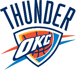
- Light Blue which is the color found on the Oklahoma state flag 3. The letters, OKC - Oklahoma City and the team name 'Thunder' are quite prominent and use the dark blue color |
The name Thunder was the most popular choice for the team logo, primarily because of the powerful storms that occur in the area know as Tornado Alley. Wind, Barons, Marshalls, Energy and Bison were some of the names under consideration.
Overall the logo is quite plain and does not make me go "Wow". The logo does not have anything obvious to represent the state or the city (like the Denver Nuggets logo shows the snow capped peaks). It does not have anything to represent the Thunder, except perhaps the orange and blue streaks that look like Lightening.
Other notes on the logo
- The Thunder worked with Ackerman-McQueen, Oklahoma City, and the NBA to develop the logo.
- The logo was launched with the AC/DC's big hit Thunderstruck".
Brooklyn Nets Logo - Design and History
 |
|
The Brooklyn Nets are a professional basketball team based in the New York City borough of Brooklyn. They are members of the Atlantic Division of the Eastern Conference in the NBA. The team is one of two NBA franchises playing in New York City, along with the New York Knicks. Popular rapper and businessman Jay-Z is also a part owner of the Brooklyn Nets. The Brooklyn Nets were called the New Jersey Nets until the end of the 2011-2012 NBA season after which they were relocated to Brooklyn, NY. In May 2012, the Nets unveiled two logos for their organization, a primary and a secondary logo. The new primary logo retains the shield from its New Jersey Nets logo but adds the 'B' for Brooklyn. The basketball has been on every logo of the franchise since 1967 when they were called the New Jersey Americans. This logo continues that traditional as well. Brooklyn is also displayed prominently at the bottom to round out the design of the primary logo. The secondary logo, takes off from the primary logo by retaining the basketball and the B, but "Brooklyn" and "New York" surround the ball. The logos have been designed by Jay Z and will have a black-and-white color scheme, which apparently pays homage to the old New York subway signage system. |
Overall, the approach taken by the Brooklyn Nets is quite different because they have gone with a Black and White theme which make make it hard to put the logo on certain colors. However the Black and White combination can also be used quite effectively due to its striking contrast. No NBA team has B/W uniforms but many soccer teams use B/W uniforms and they look sharp. Time will tell how the logo will be received. Hopefully, the Brooklyn Nets will have more success than the NJ Nets.
Bharat Matrimony's Racist Ad
Having lived outside India for many years, I have often seen many Indians complaining about discrimination and racism towards Indians in foreign countries. We rarely, if ever stop and think what a discriminatory society we are. From the age-old caste ssystem, to North Indians calling all South Indians Madrasis or calling Indians from North East India Chinky, we just discriminate. If I bring in religion, states, castes, regions the matter just gets too complicated. Even living in the US, I have heard Indians calling African Americans Kallu or call all East Asians Chnky. So perhaps, this ad below from Bharat Matrimony should really not surprise or shock me but it does. I have been seeing this ad on the South Asian channels and I am shocked that they have been running this ad on TV for so long. Take a look at it and see if you think its racist or not.
Still not convinced? Lets retry the same ad with a white American family and the son brings home a girl with tanned skin. Lovely old grandma goes, "How come he is dating that Brownie?". Our groom-to-be explains that his girlfriend has just returned from a vacation in Hawaii and so her skin is tanned. Everyone laughs and there is a huge sigh of relief. Cookies, Anyone?
Imagine this ad being shown on television here, there would be a huge uproar and social media would be going nuts. Unfortunately, this ad continues to play and its all fun and games. The least I would request is that if you are looking for a bride or groom, stay away from Bharat Matrimony and its related sites and use some other provider. Thanks for reading.