Baltimore Ravens Logo - Design and History
The Baltimore Ravens are a professional American football team based in Baltimore, Maryland. They compete in the AFC North Division of the American Football Conference (AFC) in the National Football League (NFL). The Ravens have won two Super Bowl titles, Super Bowl XXXV, in the 2000 season against the New York Giants. They won again in the 2012-2013 season. The Ravens have been a leading team in the NFL in the last few years having made many playoff appearances in that time. They are known for their tough defence lead by Ray Lewis (who announced his retirement at the end of the 2012-2013 season)
The Ravens were chosen from a Baltimore Sun telephone poll in 1996, the name is borrowed from a well-known poem by Baltimore native Edgar Allen Poe. Poe lived in Baltimore before his death in 1849 and his body is buried in Baltimore. The Ravens logo consists of a mean looking Raven in the team colors of purple and gold with the letter B. The mean looking Raven fits well with the strength of the team - mean defense.
Miami Heat Logo - Design and History
The Miami Heat are a professional basketball team based in Miami, Florida, United States. The Heat were formed in 1988 as an expansion franchise along with the Charlotte Hornets and they along with the Orlando Magic are the only two NBA franchises to represent the state of Florida. The Miami Heat have had some up and down years through their life in the NBA and finally won the Championship in 2006 defeating the Dallas Mavericks. In 2010, the Heat shot into the limelight by signing LeBron James and Chris Bosh to join Dwanye Wade creating what they believe will be a multi-Championship winning team (some call them the Heatles, while others called them the cHeats)
The origin of the name Heat are sketchy but obviously reflects the year-round hot/warm weather of Miami. It is said that the name was selected in some type of contest.
The logo is pretty simple and shows the follow main elements
- A basketball on fire going through a basketball hoop.
- The T on the word Heat also shows a little flame on the top
- The color red is the prominent color on the logo and is also the color of their jerseys
SuperBowl XLVII 2013 Logo Design
 |
|
Super Bowl XLVII will be the 47th annual edition of the Super Bowl in American football, and the 43rd annual championship game of the modern-era National Football League (NFL). The game, to be played on February 3, 2013, will pit the champions of the AFC, the Baltimore Ravens and the NFC champion, San Francisco 49ers and will be held at Mercedes Benz Superdome in New Orleans, Louisiana. This will be the first time in history that two brothers are head coaches of the respective teams. Hence this event has been unofficially nicknamed, the Harbaugh Bowl or the SuperBaugh.
SuperBowl XLVI will be between the AFC Champions - Baltimore Ravens and the NFC Champions - San Francisco 49ers. |
I am personally not thrilled with this decision by the NFL. If you look at the Super Bowl logos from the past you can see they each had a unique style that represented various aspects of the region, the country, the game etc. Some logos were really well designed and some were cheesy, but that was the fun of it. Going forward, all the logos are going to the equally standardized (read Boring!!!)
See all the SuperBowl Logos here.
See the SuperBowl XLII Logo and the SuperBowl XLI Logo.
Pro Bowl 2013 Logo Design
The Pro Bowl is the all-star game of the National Football League (NFL). Since the merger with the rival American Football League (AFL) in 1970, it has been officially called the AFC-NFC Pro Bowl, matching the top players in the American Football Conference (AFC) against those in the National Football Conference (NFC). Currently, players are voted into the Pro Bowl by the coaches, the players themselves, and the fans.The Pro Bowl has been played in Hawaii since 1970 except for 2009 when it was held in Miami. The 2013 game will be held in Hawaii as well and will be played on Jan 27th, 2013, a week before Super Bowl XVII.
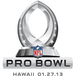
The Pro Bowl logo, just like the Super Bowl logo has been standarized in 2011 and has taken the same black & white steel feel to it. The logo consists of the following key elements
- The logo is in the shape of the Pro Bowl trophy, which is basically the shape of a football.
- There are 4 stars on each side representing the 4 conferences in the AFC (AFC North, AFC South, AFC East, AFC West) and the NFC (NFC North, NFC South, NFC East, NFC West)
- The only non black and white element of the logo is the colorful NFL logo at the bottom of the trophy.
New Orleans Pelicans Logo - Design and History
 |
The New Orleans Hornets are a professional basketball team based in New Orleans, Louisiana. They play in the Southwest Division of the Western Conference of the National Basketball Association. The franchise began play during the 1988€“89 NBA season as the Charlotte Hornets, based in Charlotte, North Carolina, where they were located for fourteen seasons. Following the 2001€“02 season, the team relocated to New Orleans, becoming the New Orleans Hornets In January 2013, the Hornets announced that they would change their name to the New Orleans Pelicans from the 2013-14 NBA season. The new name is taken from Louisiana's state bird, the Brown Pelican. With the new name also came a new logo - a menacing pelican holding a basketball in a blue, gold and red color scheme. On closer inspection of the logo, there are a number of distinct elements of the logo and I will discuss the aspects that I have been able to read and pick up on
|
After moving from Charlotte and being displaced for a while, the team may have lost its identify. In order to give the team its identity back, the new logo and name change is warranted and I feel is a good change for the team. The logo is nice and colorful, identifies well with the state and city and certainly a step up from the currently boring white and teal colors of the Hornets. The team has a future superstar in Anthony Davis, who may be a long term player for them. Having his era start with a new branding is a step in the right direction and may be the dawn of a championship winning team.
New England Patriots Logo - Design and History
 |
The New England Patriots, commonly called the "Pats", are a professional American football team based in the Greater Boston area, playing their home games in the town of Foxborough, Massachusetts. The team is part of the East Division of the American Football Conference (AFC) in the National Football League (NFL). The team changed its name from the original Boston Patriots after relocating the team to Foxborough in 1971, although Foxborough is a suburb of Boston, 22 miles (35 km) away. For the greater part of the 2000 decade, they have been quite the dominant team led by coach Bill Belichick and quarter-back Tom Brady. The team was named the Patriots because of the area€™s heritage as the birthplace of the American Revolution. |
The Patriots introduced their current logo in the 1993 season when the team underwent a major change in the uniform, colors and logo. The logo is a silhouette of a patriot with the primary colors of the US flag (Red, White and Blue) and a star on the hat. The Patriots logo is also known as the "Flying Elvis" to some because of its slight resemblance to Elvis Presley's long sideburns.