World Famous Logos
Starbucks Logo - Design and History
- Details
- Parent Category: History of Logos
- Category: Worlds Best Brands and Logos
- Hits: 65649
 |
Starbucks Corporation is a coffeehouse chain based in the United States. Named after a character in the novel Moby Dick, it is the largest coffeehouse company in the world, with over 7500 self-operated and 5500 licensed stores in 39 countries. The current company logo, modeled after a 15th century Norse woodcut, is a mixoparthenos, or "twin-tailed mermaid, or siren as she's known in Greek mythology. The company and the logo have an interesting history. In Jan 2011, Starbucks released a new version of the logo with a couple of big changes and some subtle changes as well. The two major changes made to the logo are
|
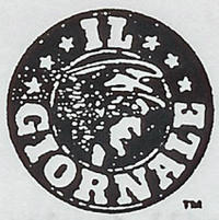 |
Starbucks was founded in Seattle, Washington, in 1971 as a local coffee bean roaster and retailer called Starbucks Coffee, Tea and Spices. Howard Schultz joined the company in 1982 and was inspired on a trip to Italy to develop a similar espresso bar and coffeehouse culture in the United States. To advance the concept, he founded the company Il Giornale three years later. In 1987, Schultz purchased Starbucks, merged it with Il Giornale, and renamed the company Starbucks Corporation. The logo on the left is that of the Il Giornale company. As you can see, the Il Giornale logo is somewhat similar to Starbucks logo i.e being circular and having a band. |
|
|
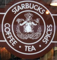
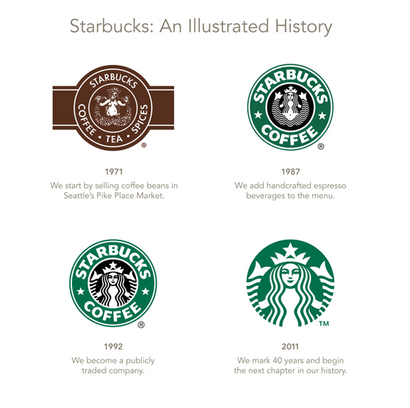
The original logo, as seen on the left, the Starbucks siren was topless and had a fully-visible double fish tail. The original logo has raised some controvery because of the bare chest, but the logo continues to appear on some of the products like the Starbucks Anniversary Blend 1 lb coffee bags. Both the original logos seem to be perfect on wooden crates. |
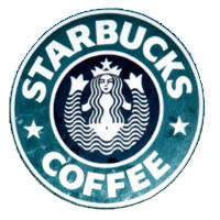 |
In the second version, her chest was covered by her flowing hair, but her navel was still visible, and the fish tail was cropped slightly. The logo also inherited the stars from the Il Giornale logo. |
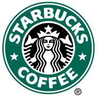 |
In the current version, her navel and chest are not visible at all, and only vestiges remain of the fish tails. |
Click here for a Starbucks Parody Logo.
Other Starbucks Logo Related News:
Battle brews over coffee logo - Starbucks is suing a mom-and-pop store in Seattle over copyright infringement of its logo.
A look at the future of Starbucks - Unveiling of the new Starbucks logo
Source: http://en.wikipedia.org/wiki/Starbucks
More World Famous Logos
More Car Logos
Logo Parodies
