Aston Martin Logo - Design and History
- Details
- Parent Category: Travel Logos
- Category: Car Logos - Design and History
- Hits: 5258
Aston Martin Lagonda Ltd. is a British luxury car manufacturer based in Newport Pagnell, Buckinghamshire. Up to the year 2003, approximately 20,200 cars had been built by Aston Martin. Today, the company is part of the Premier Automotive Group division of Ford Motor Company.
Aston Martin was founded in 1914 by Lionel Martin and Robert Bamford. The two had joined forces the previous year to sell cars made by Singer. Martin raced specials at the Aston Hill Hillclimb near Aston Clinton, and the pair decided to make their own vehicles. They acquired premises at Abingdon Road in Kensington and produced their first car in March 1915.
The company name was derived from Aston Hill and Lionel Martin.
Aston Martin information from Wikipedia, the free encyclopedia.
Jeep Logo - Design and History
- Details
- Parent Category: Travel Logos
- Category: Car Logos - Design and History
- Hits: 46644
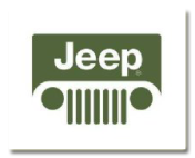
The Jeep logo as it stands currently represents the front of the vehicle. It consists of two circles representing the headlights and vertical bars representing the grill in the front of the car. The word Jeep runs on top of the logo.
Jeep started out as a military vehicle and was later considered a Willys-Overland model, so it didn't really originally have a logo unless you count the word "Jeep" in parentheses, which appeared in the same typeface from civilian introduction in 1946 well into the 1960s. Probably the closest thing to a Jeep logo appeared in 1963 in the center of Wagoneer and Gladiator hubcaps and steering wheels. This was the same time Kaiser dropped the Willys name, changing the division name from Willys Motors to Kaiser Jeep Corporation and establishing Jeep as a stand-alone brand name. This emblem was a circle (in some illustrations looking vaguely like a stylized dendition of a Warn locking hub) with two gold quarters, two red quarters, and the "Jeep" name across the middle. After AMC's purchase of Jeep in 1971, the gold was replaced by blue.
Toyota Logo - Design and History
- Details
- Parent Category: Travel Logos
- Category: Car Logos - Design and History
- Hits: 131723
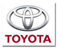
I own a Toyota Camry and never gave much thought to what the logo meant. From far it looked like a T to me, which stood for Toyota. While doing the research for this logo, I found out that it is actually three elipses depicting the heart of the customer, the heart of the product, and the ever-expanding technological advancements and boundless opportunities that lie ahead.
I finally found the official explaination from Toyota, thanks to JoAnn Paules
The current Toyota Mark consists of three ovals: the two perpendicular center ovals represent a relationship of mutual trust between the customer and Toyota. These ovals combine to symbolize the letter "T" for Toyota. The space in the background implies a global expansion of Toyota's technology and unlimited potential for the future.
http://www.toyota.co.jp/en/vision/traditions/nov_dec_04.html
One website even described it as a cowboy with a big hat. :-)
Citreon Logo - Design and History
- Details
- Parent Category: Travel Logos
- Category: Car Logos - Design and History
- Hits: 37051

The Citroen logo looks like something you might see on an American cartoon soldier - two inverted Vs. Andre Citroen - imagine one of those old black and white photographs with an ancient man in a white beard - started in the motor trade by building gear wheels before branching out into the motorcar, and the twin chevrons << are meant to represent gear teeth in honour of the old engineer's early fettlings
Fiat Logo - Design and History
- Details
- Parent Category: Travel Logos
- Category: Car Logos - Design and History
- Hits: 39887
The FIAT name is an acronym for Fabbrica Italiana Automobili Torino (Italian Car Factory of Turin), founded by a group of investors--Giovanni Agnelli among them--in 1899. The current Fiat logo has the letters F-I-A-T written with a silver line between each of them. The lines were added by the company's design chief when one day passing under the factory, he noticed the sky at the backdrop of the huge FIAT letters on the top of the building. The lines added are actually the spaces that he saw in the name over the building and decided to keep it.