Logo Parodies
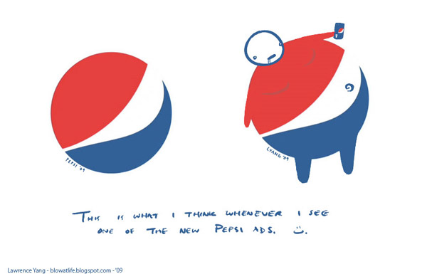
Pepsi Logo Parody
- Details
- Parent Category: History of Logos
- Category: Logo Parodies
- Hits: 12682
 | In 2009, Pepsi updated their logo to have the little wide gap between the red and white. Lawrence Yang from Suck At Life.com created this parody. |
Listed with permission from Lawrence Yang - blowatlife.blogspot.com
These images were sent to my over email. If its violating someone's copyright, please let me know and I will take it down.