Internet Company Logos
Buy.com Logo - Design and History
- Details
- Parent Category: History of Logos
- Category: Internet Company Logos
- Hits: 17247

Buy.com is one of the original online retailers in the United States. It began selling computers and electronics in 1997 , the company has since diversified its offerings to categories such as software, books, movies, music, games, toys, digital cameras, cellular phones, and magazines. Buy.com over the years has tried very hard to be like Amazon.com but clearly lags behind in the technology.
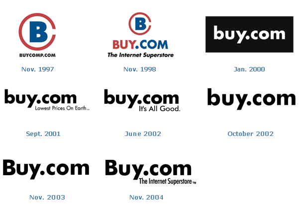
The Buy.com logo has undergone one major change over the years when in Jan 2000, it changed its logo to the simple Buy.com text. The original logo was a Big B enclosed in a C. I am not sure if its was meant to indicate Buy.Com. Since the big change in 2000, the logo has undergone some minor changes especially in the area of the tag lines such as
- Lowest Prices on Earth
- It's All Good
- The Internet Superstore
As of 2013, Buy.com is now called Rakuten.com so effectively this logo is now dead.
The image below shows the complete history of the buy.com logos.

Source: http://www.buy.com/toc/logo-evolution/15790.html
The Buy.com logo is a registered trademark of Buy.com. Use of the logo here does not imply endorsement of the organization by this site.
More World Famous Logos
More Internet Company Logos
Logo Parodies