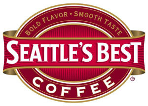
Seattle's Best Coffee Logo - Design and History
 |
|  |
Seattle's Best Coffee is a specialty coffee retailer and wholesaler based in Seattle, Washington. It is also owned by Starbucks, which purchased the company in 2003. Seattle's Best Coffee has retail stores and in grocery sub-stores in 20 states and provinces and the District of Columbia. Sub-stores can also be found within many other businesses and college campuses, including JC Penney Department Stores and Subway Restaurants.
In 2011, Seattle's Best wanted to expand the reach of the brand and sell it in convenience stores, drive-through kiosks, coffee carts, vending machines and mobile trucks. The company has already reached deals to sell Seattle's Best at Burger King and Subway restaurants and at AMC Entertainment Inc. movie theaters. Along with this new push, they also introduced a new logo which was strikingly different from the previous logo and a new tag line "Great Coffee everywhere"
The logo is radically different from the previous logo which has a more bold Red color with bigger fonts and a hint of golden-brown which probably gave it some feeling that it was related to coffee (perhaps its my imagination). The new logo is terribly simple, even to the point where it looks like the logo of a generic store brand. The font is also very generic and does not stick in my head. Even the coffee mug and the drop of coffee do not evoke any coffee thoughts, perhaps a handle to the mug may have helped. Some bloggers have even suggested that the logo could be a used by a blood bank. The old logo has been around for about 40 years and is definitely bolder and more vibrant than the new one.
I remember walking into Borders and the old logo is so large and looming that you cannot miss it. I personally don't think the new logo will look so attractive in stores. If the aim is to tell consumers that they are a simpler, cheaper more accessible brand, then perhaps the simplicity will work, only time will tell. Gap Inc tried to launch a simpler logo and was met with such a backlash that they had to revert to the old logo in a few days. Its a bold move and they have stuck with it, lets see what happens.
The logo was designed by a Seattle based company called Creature.
More Coffee Logos
More Car Logos
More World Famous Logos
Logo Parodies