Mazda Logo - Design and History
Mazda Motor Corporation is a Japanese automotive manufacturer based in Hiroshima, Japan. It is said that Mazda coincides with the anglicized pronunciation of the founder's name, Jujiro Matsuda, who was interested in spirituality, and chose to rename the firm in honor of both his family and Zoroastrianism. The word Mazda derives from Ahura Mazda, the Avestan language name for a divinity exalted by the ancient Iranian prophet Zoroaster, as the source of wisdom, intelligence and harmony.
The current logo attempts to capture the spirit of Mazda, the stylised "M" evokes an image of wings in flight and symbolises the Mazda's flight toward the future. The "V" in the centre of the "M" spreads out like an opening fan, representing the creativity, vitalty, flexibilty and passion that is Mazda. The symbol as a whole expresses the sharp, solid feeling that Mazda will be seeking in all of its products. The dynamic circle symbolises our readiness to spread our wings as we enter the 21st century.
Twitter India Directory
With Twitter being on fire for the last few months and with more and more Indian celebrities, business, organizations etc tweeting, I thought it was time to add an Indian Twitter Directory to my website. This directory will contain the links of all India related Twitter pages. I have started with the following categories and there are a few entries already which will be updated over the next few weeks.
- Bollywood and Indian Celebrities
- Entertainment
- Humour
- Jobs and Careers
- News and Media
- Non-Profit Organizations
- Science and Technology
- Shopping
- Sports
- Television and Radio
- Travel and Tourism
If you have a Twiitter page, you can submit it to the Twitter India directory.
Microsoft Retail Store Logo Design
 |
In a bid to compete with the Apple Store, Microsoft had announced the launch of the Microsoft retail store in the early part of 2009. Microsoft hired a veteran WalMart executive to help start this new initiative. Details of the store are quite sketchy and the first view for buyers would be in the Fall when Microsoft plans to open two stores, one in Scottsdale, Arizona and Viejo, California. In preparation for the launch of the store, Microsoft unveiled their MS Store logo in August, 2009. The logo is quite simple and is a square version of their Windows flag. The 4 colors, Red, Green, Yellow and Blue are in the same position as the Windows logo (See below). The individual squares have a gradient, which gives it a slightly different look. I am not sure what the point is but if you stare at the logo long enough, you are likely to get hypnotized. Maybe that the point. I am not sure what the stores will look like but given the colorful logo, I am assuming it will be in sharp contrast to the plain white Apple stores which is so simple in their design. We will find out shortly.
|
Baskin Robbins Logo - Design and History
 |
Baskin-Robbins is a global chain of ice cream parlors founded by Burt Baskin and Irv Robbins in 1953, from the merging of their respective ice cream parlors, in Glendale, California. It claims to be the world's largest ice cream franchise, with more than 5,800 locations, 2,800 of which are located in the United States. The Baskin-Robbins ice cream parlors started as separate ventures from Burt Baskin and Irv Robbins, owning Burt's Ice Cream Shop and Snowbird Ice Cream respectively. Snowbird Ice Cream featured 21 Starting 2006, the company went through a campaign to change its brand including redesign of its stores, its website and even its logo. The current logo is clever in that it incorporates the 31 (in pink) that represents the 31 flavors, cleverly embedding it in the B R of the logo. The font was also changed from the a regular straight font to a more zig-zag font. The pink represents the pink spoon which is given when customers ask for samples (see below for more history) |
The idea for having 31 flavors came from the Carson-Roberts advertising
agency (which later became Ogilvy & Mather) in 1953, along with the
slogan "Count the Flavors. Where flavor counts." 31 was also more than
the 28 flavors then famously offered at Howard Johnson's restaurants.
Burt and Irv also believed that people should be able to sample flavors
until they found one they wanted to buy - hence the iconic small pink
spoon. During a now famous promotion, Amy Boggioni led a group of three
who finished 31 scoops of all 31 flavors in under 31 minutes.
Baskin-Robbins
sells ice cream in over 30 countries, including Canada, Japan, Mexico,
Bahrain, the United Kingdom, the United Arab Emirates, Egypt, Saudi
Arabia, Australia, the Philippines, Thailand, Vietnam, Indonesia,
Malaysia, Bangladesh, South Korea, India, Pakistan, Panama and Taiwan.
Volvo Logo - Design and History
The Volvo Group is a Swedish supplier of commercial vehicles such as trucks, buses and construction equipment, drive systems for marine and industrial applications, aerospace components and financial services. Volvo was founded on 14 April 1927 in the city of Gothenburg, as a spin-off from the roller ball bearing maker SKF.
The name Volvo means "I roll" in Latin and is derived from the Latin word "volvere" which means "to roll". The name originated from the original company that manufactured bearings for the car industry. The logo for Volvo is the ancient symbol of Iron, which is a circle with an arrow pointed diagonally upwards to the right. This symbol also represented "Mars, the God of War" and also the symbol for "Man" as well. Volvo cars are also traditionally known for the safety features. The iron symbol was used to also reflect the strong tradition of th Swedish Iron Industry along with its properties such as safety, quality and durability. The name of the car "Volvo" also runs across the logo against a blue background.
The Volvo car and brand was sold to Ford in 1999.
Abarth Logo - Design and History
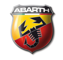
Abarth is an Italian racing car maker founded by Italian-Austrian Karl (Carlo) Abarth in Turin in 1949. Abarth was sold to Fiat on July 31 1971, and the racing team sold to Enzo Osella. Abarth became the racing department of Fiat, managed by famed engine designer Aurelio Lampredi.
The Abarth logo consists of the following key elements
- The shape of the logo represents a shield which symbolizes the notion of victory. You can find some of the other racing logos like Porsche also have a shield in their logo.
- The red, white and green represent the colors of the Italian Flag.
- The scorpion is the key part of the logo and represents the astrological sign of Karl Alberto Abarth who was born on November 15th 1908.
- The red and yellow colors apparently represent the racing world.
