JC Penney Logo - Design and History
 |
|
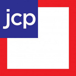
J. C. Penney Company, Inc. is a chain of American mid-range department stores based in Plano, Texas, a suburb north of Dallas. The company operates over 1100 department stores in all 50 U.S. states and Puerto Rico. JC Penney has been in business for over 75 years now and is one of the most widely recognized brands in the United States. In Jan 2012, JC Penney unveiled a new logo, shown alongside to go with their new policy of more standardize pricing, which they called "Fair and Square". The new logo and rebranding effort comes just a year after their last rebranding effort. The main aspects of the logo as below - the letters 'jcp' now appear in a blue box on top of a red square frame. In the previous design, the 'jcp' was in a red frame next to the 'enny' which was in a white box and looked a bit odd. Separating the 'jcp' makes it clear. |
The new logo design does not excite me at all. Adding the blue into the mix take away focus from the logo. There is a lot of white space that is wasted in the logo as well. While the new logo may look OK in print or on a website, I am not sure how they would update their stores with this logo.
The reactions to the logo have been mainly negative but only time will tell if the new branding and the pricing model were effective.
Microsoft Retail Store Logo Design
 |
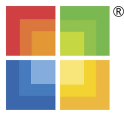
In a bid to compete with the Apple Store, Microsoft had announced the launch of the Microsoft retail store in the early part of 2009. Microsoft hired a veteran WalMart executive to help start this new initiative. Details of the store are quite sketchy and the first view for buyers would be in the Fall when Microsoft plans to open two stores, one in Scottsdale, Arizona and Viejo, California. In preparation for the launch of the store, Microsoft unveiled their MS Store logo in August, 2009. The logo is quite simple and is a square version of their Windows flag. The 4 colors, Red, Green, Yellow and Blue are in the same position as the Windows logo (See below). The individual squares have a gradient, which gives it a slightly different look. I am not sure what the point is but if you stare at the logo long enough, you are likely to get hypnotized. Maybe that the point. I am not sure what the stores will look like but given the colorful logo, I am assuming it will be in sharp contrast to the plain white Apple stores which is so simple in their design. We will find out shortly.
|
Maxwell House Coffee Logo - Design and History
 |
Maxwell House is a brand of coffee manufactured by a like-named division of Kraft Foods. It is named in honor of the Maxwell House Hotel in Nashville, Tennesee. The coffee was provided to the hotel beginning in 1892 by local manufacturers, Leon T. Cheek and Joel Owsley Cheek, who developed the blend. In 1901 Cheek and a partner, John Neal, established the Nashville Coffee and Manufacturing Company. The name was changed to Cheek & Neal (later Cheek-Neal) Coffee Company in 1903. |
For several years, the ads made no mention of Theodore Roosevelt as the phrase's originator. By the 1930s, however, the ads began to mention the former President's name. In modern times, Maxwell House has distanced itself from its own original claim stating that the slogan was actually written by Clifford Spiller, former president of General Foods Corporation and did not come from a Roosevelt remark overheard by Cheek-Neal. The phrase remains a registered trademark for the product and appears on its logo.