St. Louis Rams Logo - Design and History
- Details
- Parent Category: History of Logos
- Category: NFL Logos
- Hits: 13857
 |
The St. Louis Rams are a professional American football team based in St. Louis, Missouri. The team began in 1936 as the Cleveland Rams and existed in Cleveland until 1945 after which they moved to Los Angeles as the Los Angeles Rams. In 1995, the club moved to its current home in St Louis. The team name, Rams, comes from the nickname of Fordham University. The name Rams was selected to honor the hard work of the players that came out of that University. The logo features the head of a Ram in team colors of blue and gold. The Rams were the first team to add a logo on their helmet. Their half-back Fred Gehrke painted the Ram horns on the team's helmets in 1948 and it has been on the helmet ever since. The horns were painted in Gold. |
The original team colors were red and black but they switched to yellow and blue in 1938 and after a couple of changes between 1938 and 1973, the team selected its current colors or blue and gold. In 2000, the team made some color changes and uniform changes as well.
Washington Redskins Logo - Design and History
- Details
- Parent Category: History of Logos
- Category: NFL Logos
- Hits: 17237
 |
The Washington Redskins are a professional American football team based in the Washington, D.C. area. According to Forbes Magazine, the Redskins are the second most valuable franchise in the NFL, valued at approximately $1.467 billion, having this year been surpassed by their rivals the Dallas Cowboys. The Washington Redskins started in Boston as the Boston Braves and were later called the Boston Redskins. Their logo is the face of an Native American chief facing the right. The chief's head is placed within a yellow circle that has some yellow feathers. The yellow comes from the team colors of burgundy and gold. One of the fans has been coming to all the games since 1978 dressed as the Chief, and this man goes by the name Chief Zee. Sometimes the name "Cheif Zee" may be associated with the Logo and the reason for that is mentioned above. |
SuperBowl XLIV 2010 Logo Design
- Details
- Parent Category: History of Logos
- Category: NFL Logos
- Hits: 11561
 |
Super Bowl XLIV will be the 44th annual edition of the Super Bowl in American Professional Football, and the 40th annual championship game of the modern-era National Football League (NFL). The game will be played at Dolphin Stadium in Miami Gardens, Florida. This marks the tenth time a Super Bowl will have played in the South Florida area: five times the game has been held at Dolphin Stadium; the other five were played at the Orange Bowl. The game will be played on February 7, 2010. |
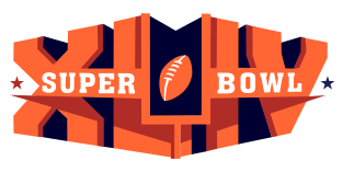
The Logo for the event is shown alongside and the following are some of the key elements in the logo.
1. Clearly the heart of the logo is the XLIV written in block letters.
2. The bold orange color, which really hurts the eye, reflects the Florida Orange
3. The L and I have been somewhat cleverly used to represent the goal post.
4. The two stars on the edges reflect the stars for the two NFL conferences (AFC and NFC). The red star represents the AFC and the blue star represents the NFC.
5. The football is the same as the football in the NFL logo.
I am personally not very impressed by the logo and it seems like that is the general impression of other folks as well. The Orange is too bright and in your face and its really an eye-sore. The block letter too are not very pleasing to the eye. With some other companies like Hertz and Jack in the Box moving to more contemporary fonts, this looks rather old fashioned.
Lets hope that the game is far more interesting than the logo.
See all the SuperBowl Logos here.
See the SuperBowl XLII Logo and the SuperBowl XLI Logo.
SuperBowl XLI Logo Design
- Details
- Parent Category: History of Logos
- Category: NFL Logos
- Hits: 18376
 |
With SuperBowl XLI right around the corner, I thought it would be apt to look at the various SuperBowl logos. The SupwerBowl is the championship game in the NFL and is played between the winner of the National Football Conference (NFC) and the American Football Conference (AFC). The SuperBowl is probably the most watched television event in the United States. |
The SuperBowl logo varies each year and typically has something in it to represent the city where the game is being played. SuperBowl XXI and XXVII were played at the Rose Bowl in Pasadena and so have a touch of rose in the logo.
The Super Bowl XLI logo features the colors orange to represent the sun and blue for the ocean. The "I" in the Roman numeral "XLI" was drawn to resemble a pylon placed at each corner of an end zone because "the goal is to get to the game." This year's logo has the same shade of orange as the logo of the host city's home team, the Miami Dolphins.
See all the SuperBowl Logos here.
Arizona Cardinals Logo - Design and History
- Details
- Parent Category: History of Logos
- Category: NFL Logos
- Hits: 16521
The Arizona Cardinals are a professional American Football team based in Glendale, Arizona. The Cardinals are members of the Western Division of the National Football Conference (NFC) in the National Football League (NFL). The Cardinals were founded in 1898, and are the oldest continuously run professional American football club in the United States.
The Arizona Cardinals are the NFL's oldest franchise and both team and nickname date back to Chicago 1901. The Owner Chris O'Brien deemed the used, faded maroon jerseys he acquired from the University of Chicago "cardinal red." The team was known as the Cardinals from then on.